Building a scalable design system for a trading platform
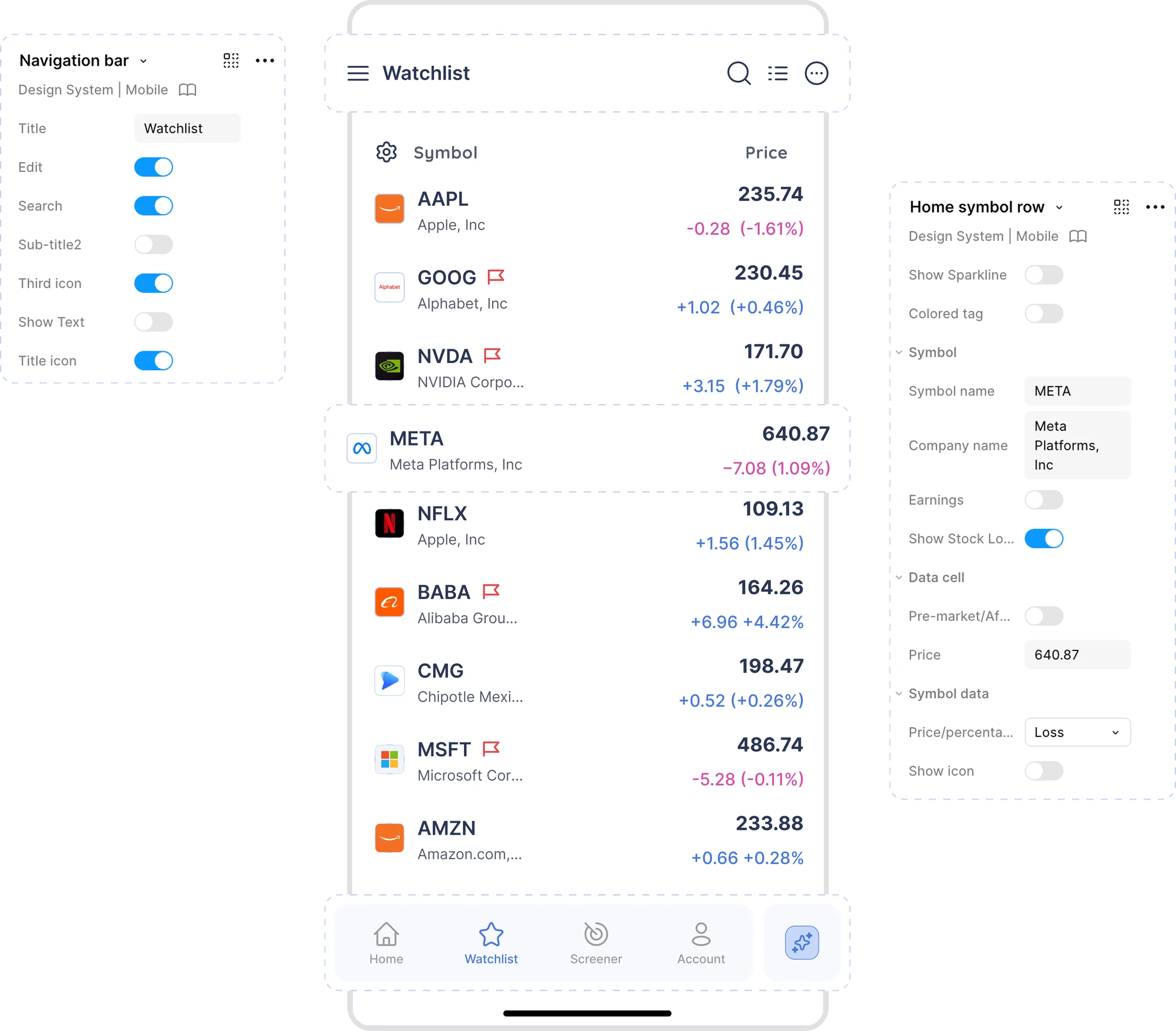
Creating a shared foundation for Deepvue's trading products
Deepvue is a stock research and trading platform for US markets, offering real-time market scanners, advanced screeners, charts, and customizable watchlists.
I worked as the sole product designer, building the mobile design system from scratch and aligning the existing web experience with the new visual foundations.
Shared foundations
Color, typography and spacing used across the products.
Reusable components
Built with properties, variants and interaction states.
Light and dark mode
Supported through semantic tokens rather than separate libraries.
Trading-specific components
Patterns for displaying complex market information.
Responsive behaviour
Defined for mobile and tablet.
Organisation and documentation
Components and their states, for design and engineering.
A growing library that supported new feature work.
Variants and properties made configurations quicker to assemble.
Less repeated clarification between design and engineering.
Inconsistent components were slowing down product development
Deepvue's interfaces had accumulated different visual patterns across features and platforms. Components varied in their typography, spacing, colors, and behavior.
As new features were introduced, these inconsistencies became harder to manage.
Outdated Components
Legacy patterns made the interface feel fragmented and hard to scale.
Duplicate Screen Work
Every screen had to be redesigned separately for light and dark mode.
Inconsistent Visual Standards
Colors, typography, and spacing varied across features and platforms.
High Design and Dev Friction
Developers needed frequent clarification, leading to delays and rework.
Build one system that keeps Deepvue consistent, cuts the repeat work, and makes new trading features quicker to design and ship.
Identifying the patterns worth standardizing
I began by looking at the components and interaction patterns used across Deepvue's trading interfaces.
The product included general interface elements such as buttons, inputs, and navigation, alongside more specialized components for displaying stock information and real-time market data. These had different requirements, so I organized the library into categories based on their purpose.
Foundations
Color, typography, spacing, and shared visual rules.
UI primitives
Buttons, inputs, controls, and other commonly used interface elements.
Data display
Components for presenting stock information, charts, and related data.
Navigation
Patterns used to move between screens, features, and workflows.
Trading-specific modules
Components for market breadth, movers, thematics, and other financial data.
A shared foundation with flexible components
I organized the system into two layers: common design foundations, and reusable components built on top of them.
Color and typography tokens handled the styling. Variants and properties handled the different contexts and states a component had to cover.
Three decisions shaped the system.
Using semantic tokens for light and dark modes
Deepvue supported light and dark interfaces, but designing both themes separately created duplication: a change to a color or a component treatment meant updating it in two places.
I introduced semantic color tokens, so components reference a color by its role rather than a fixed value.
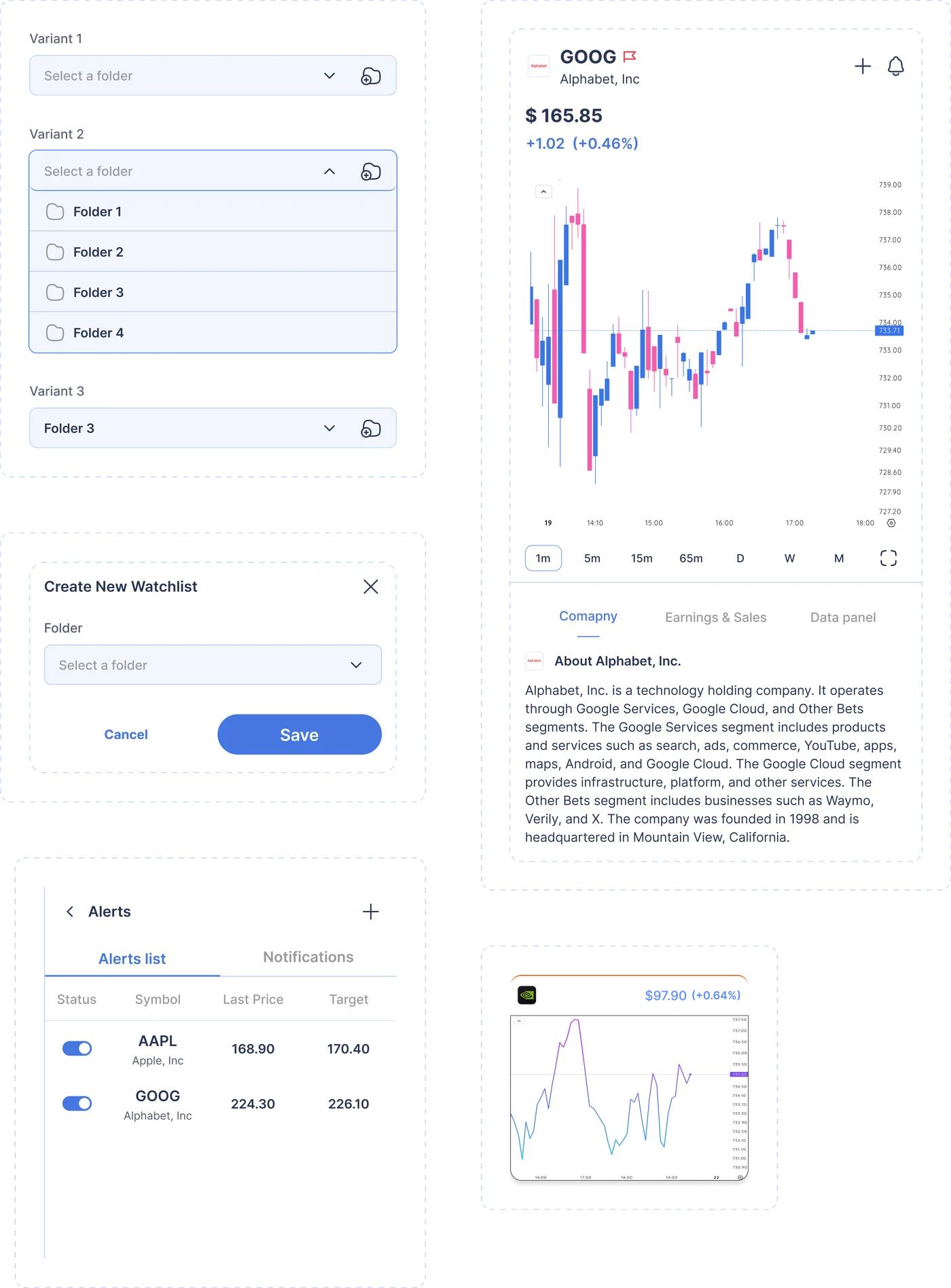
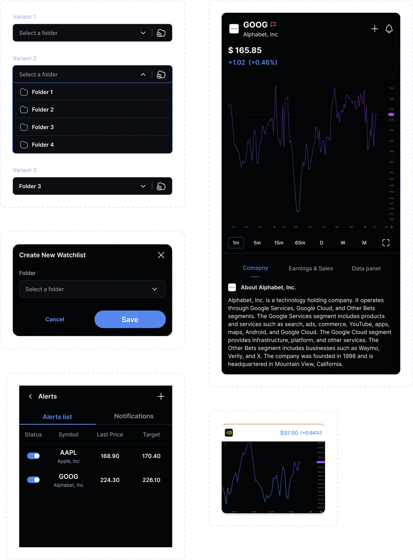
One component now serves both themes, and a change to a token reaches every screen that uses it. The same approach carried over to typography and the other shared foundations.
One set of components, two themes, with the token deciding how each one is painted.
Building components for customization
The same element had to appear in different configurations depending on the screen. Making a separate component for each one would have grown the library and made updates harder.
I built components with configurable properties: visibility toggles, content slots, state controls, nested variants, and responsive behavior.
I defined default, selected, error, and loading states in the library, so component behavior was easy to reference during design and development.
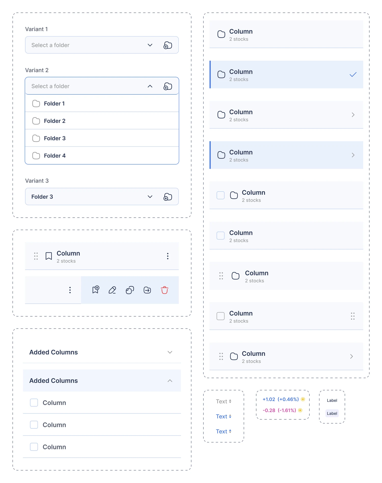
Scenarios could be prototyped without rebuilding the same UI, and every variation stayed attached to one component, so later changes only had to happen once.
Variations stayed attached to one component, so a change in the system reached every screen using it.
Creating reusable patterns for real-time market data
Deepvue's trading features showed stock details, market breadth, movers, and thematics. These modules carry dense information and still had to stay readable and consistent.
I built reusable modules for the data-display patterns that kept recurring, covering instrument details and market data alongside the specialized trading modules.
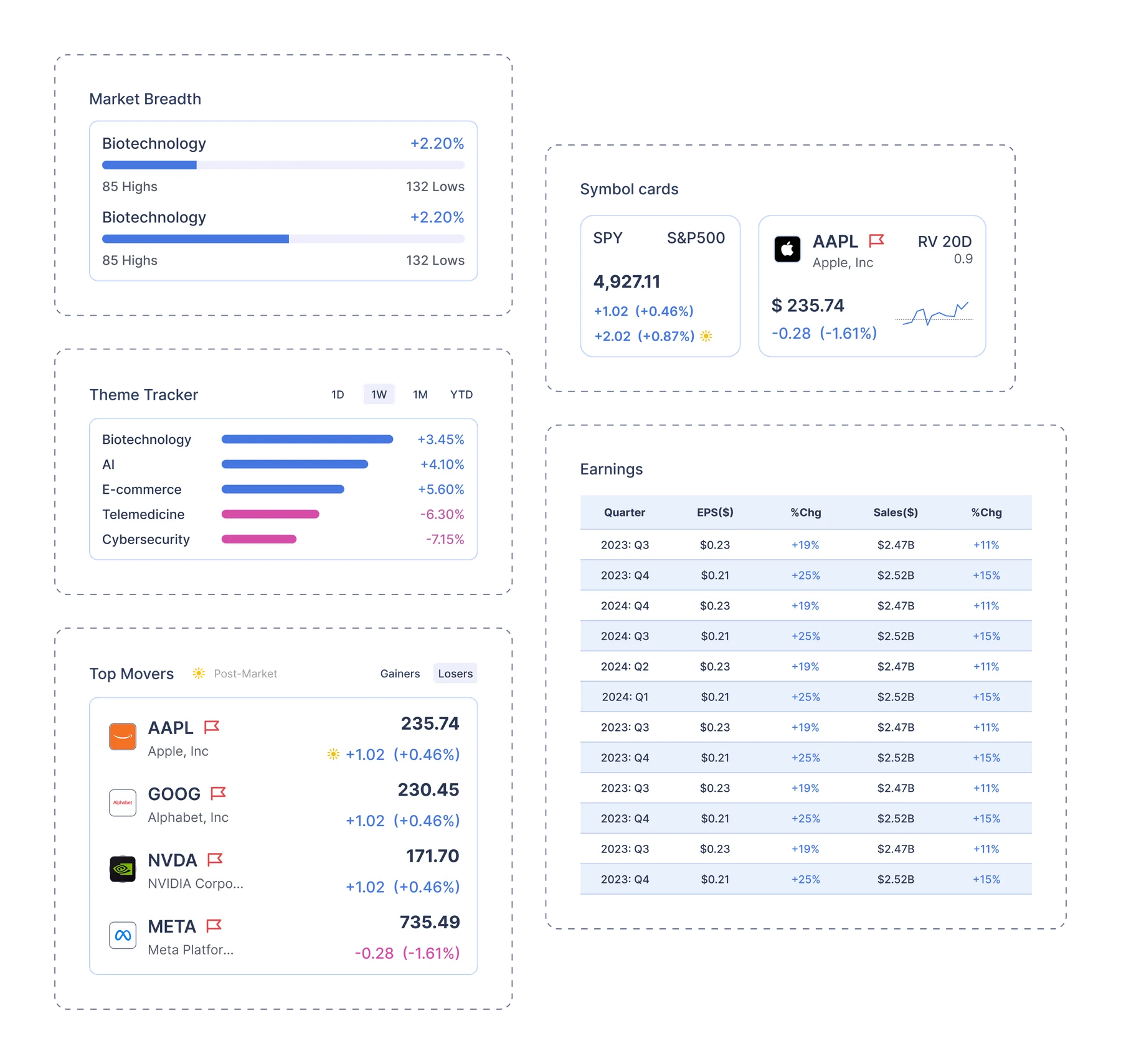
Each module follows the shared typography, spacing and color foundations while carrying its own information structure, so a new trading feature can be assembled from patterns that already exist.
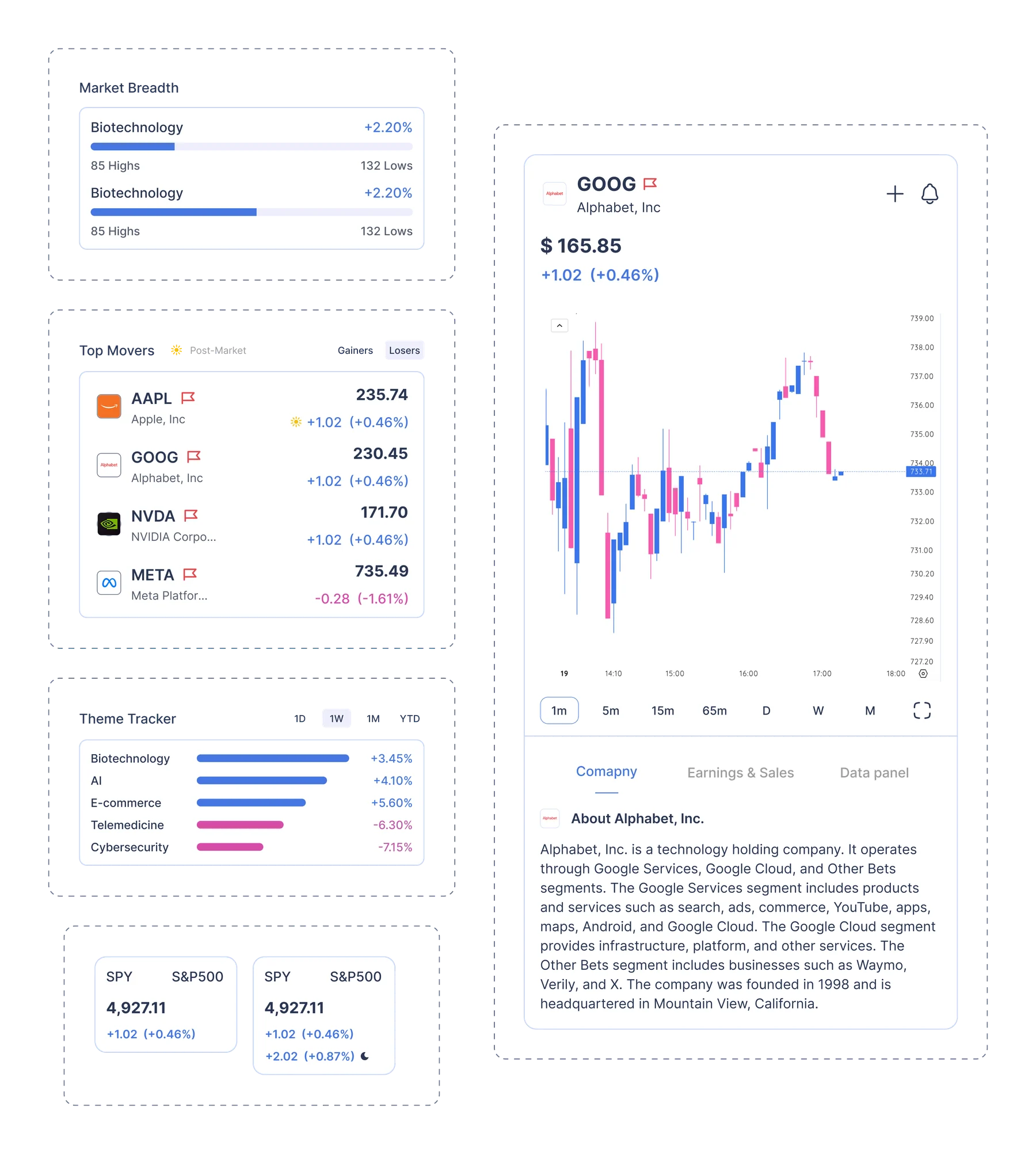
New trading features could be assembled from patterns that already existed.
A reusable system for Deepvue's trading interfaces
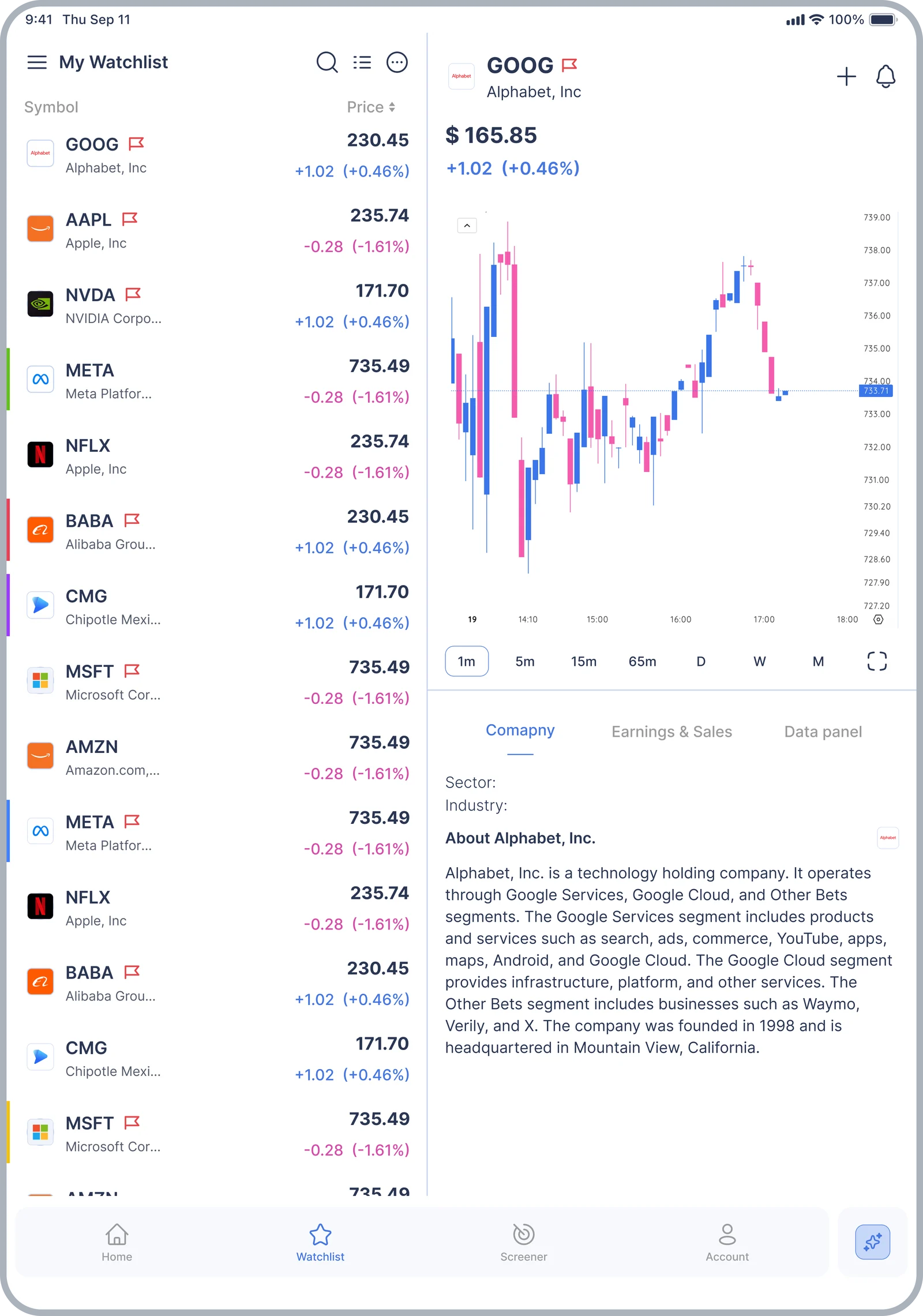
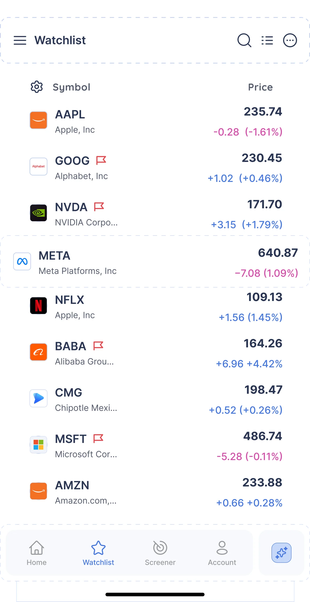
The completed system brought together the shared foundations, the configurable components, and the trading-specific modules.
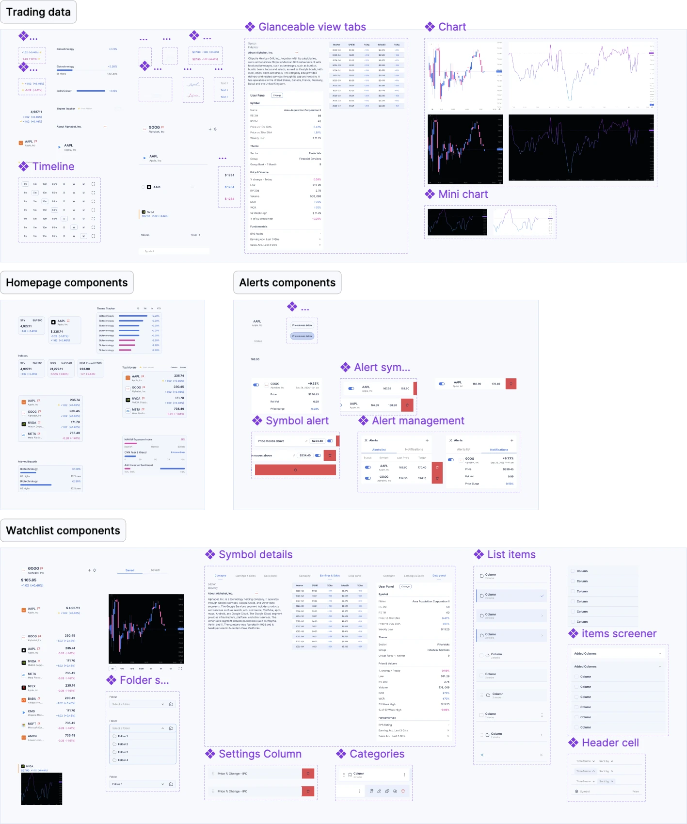
The same components carry across mobile and tablet, with matching alignment work on web.
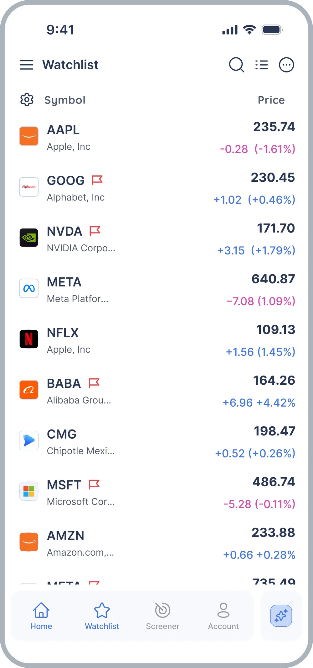
Improving design speed and consistency
Reusable components, documented states, and shared foundations reduced the need for repeated clarification and design adjustments.
Variants and component properties made it easier to assemble and test different interface configurations.
The library supported new feature development through a growing collection of reusable interface elements.
Designing components that could grow with the product
Working on the Deepvue design system as the sole designer showed me how much a strong system can shape the pace and quality of a product. Rebuilding components from scratch pushed me to think beyond individual screens and focus on patterns that could grow with the product.
Designing for real-time data across two platforms also helped me better understand how important clarity, trust, and usability are in fintech, especially when users are making sense of dense information.
Making AI responses actionable in a trading platform.